Numun Fund's grant team was manually reviewing hundreds of applications, spending 40 hours a week on it — and only approving 1% of what they saw. On top of that, there was zero centralized view of funding metrics. They couldn't even answer something basic like "how much have we funded this cycle."

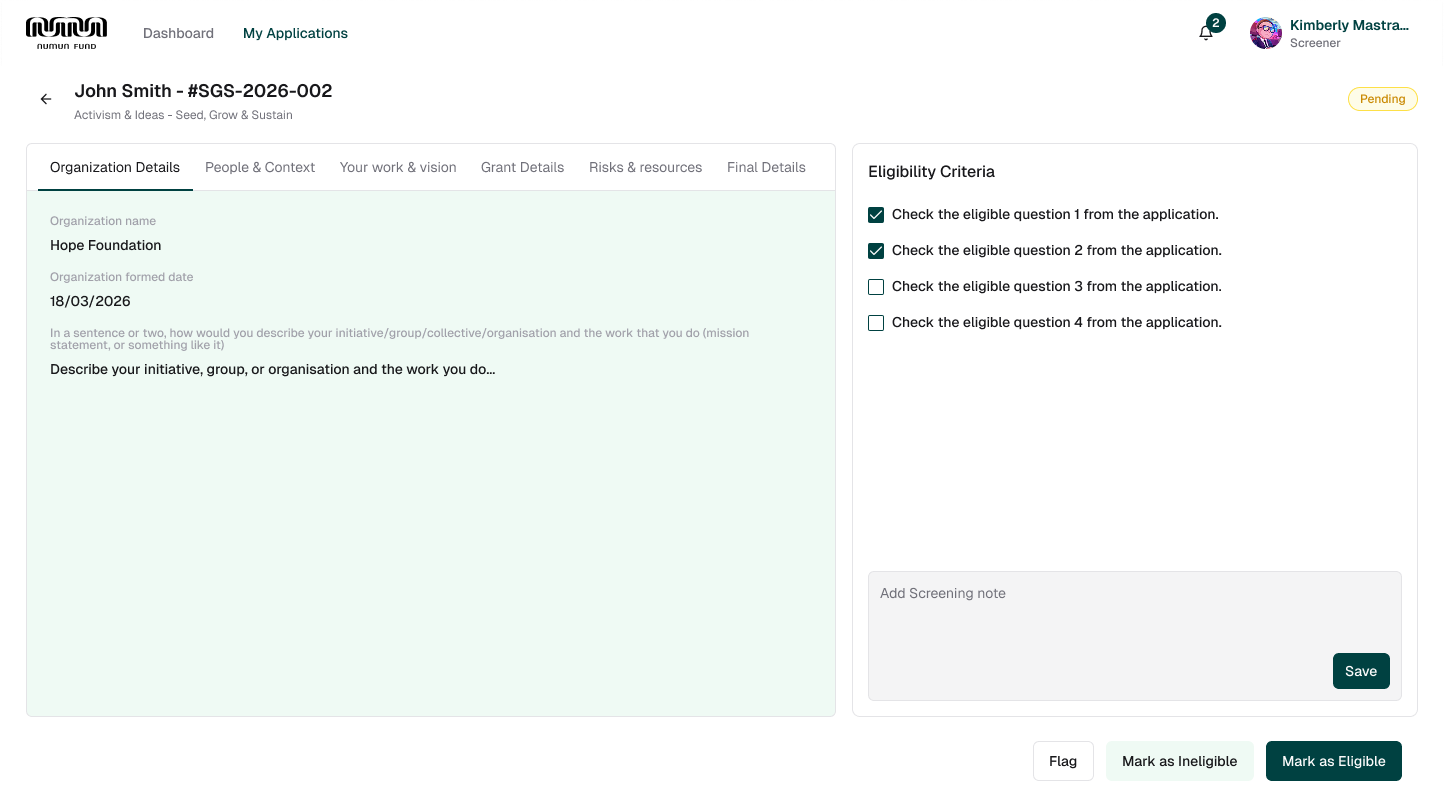
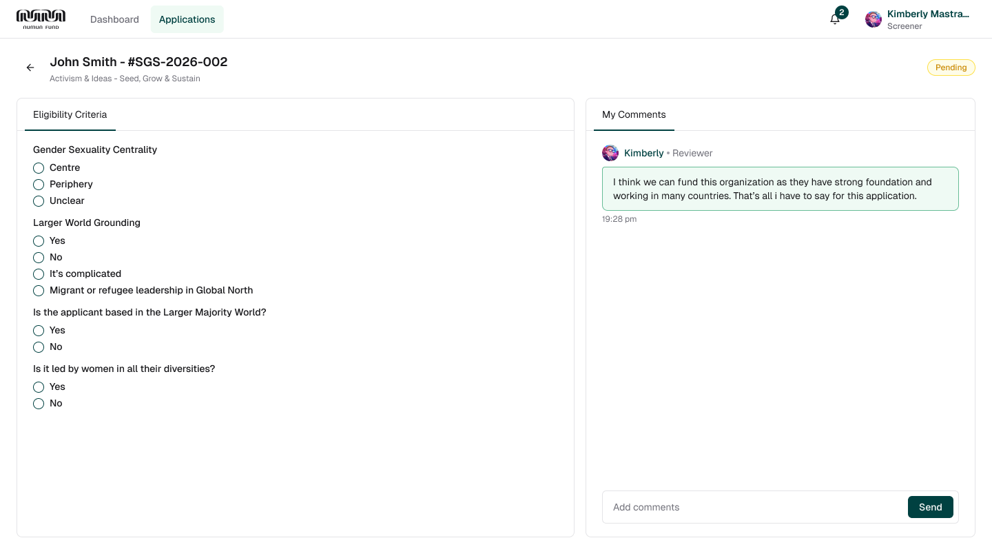
The project needed to be designed and shipped quickly to understand the actual problem. Everything we knew was based on assumptions, and we didn't have access to the core user group. So, as a designer, I came up with the idea of creating two different iterations and presenting both as interactive prototypes to the client. It was the quickest way to do A/B testing and validate our assumptions before moving forward.
Dummy description for the first card. This is a placeholder text that explains the context of this iteration point.
Dummy description for the second card. This is a placeholder text that explains the context of this iteration point.
Dummy description for the third card. This is a placeholder text that explains the context of this iteration point.
Conducted usability testing with fund users, Numun employees, and super admins to ensure each workflow was intuitive and supported real operational needs.
Since fund operations run continuously, there was limited opportunity for iterative refinements. The solution prioritized the most business-critical workflows while minimizing disruption to ongoing operations.
Established a scalable design foundation that allows new modules, workflows, and features to be introduced without requiring significant redesign or development effort.
As a designer, I can explain the design process, but if it doesn't help the business grow or solve the current problems, it doesn't matter to the stakeholders. My role was to negotiate with the stakeholders and find a solution that I could confidently justify—one that would work best for the business while minimizing the current back-and-forth and making the overall process more efficient.