


Email workdesk.avishek@gmail.com WhatsApp +91 99254 03798

Project EASA.

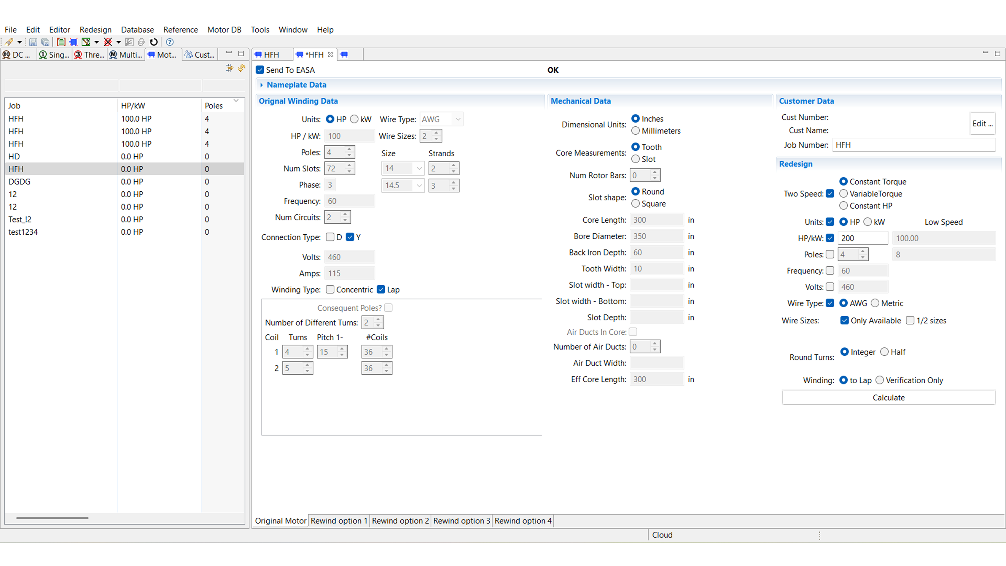
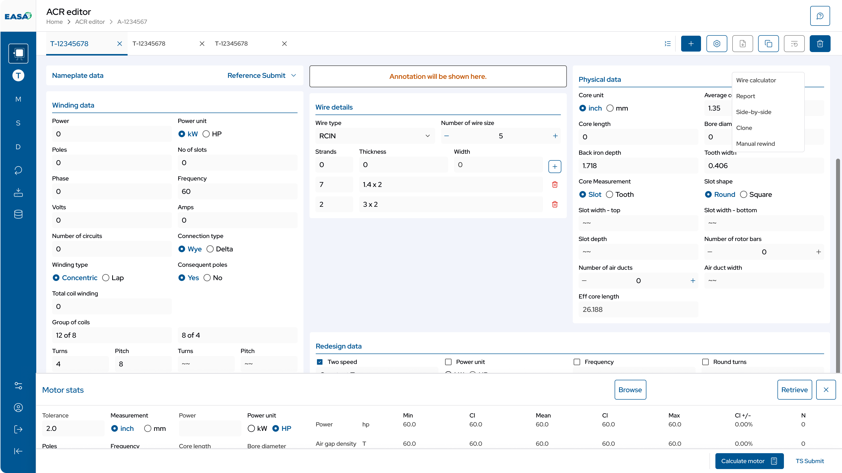
Rebuild the Windows-exclusive simulation tool for web to unlock evaluation by users on Mac/Linux/mobile, expanding the addressable user base by 25% per quarter.
Industry
Equipment repair & industrial maintenance
Timeline
13 Months
My Role
Leading UX Designer
Platform
Responsive Website
Before After Before After

Process of the Project.

    Design Process.

    Stakeholder Conversation

    Avishek Nayak
    Avishek Nayak
    Senior UX Designer
    Timothy Vogel
    Timothy Vogel
    Product Engineer
    Eugene Vogel
    Eugene Vogel
    Technical Power User
    Linda
    Linda
    CEO
    Project Team
    PMs + Dev Ops
    Anonymous
    Core Users

    Flow used by Power Users

    In this whole V4 Application, there is only 3 main user flow, which the EASA Engineers use the most.

    Searching the Database · 16:9
    Searching the Database · 16:9
    Analysing, Filtering & Removing · 16:9

    Creation of Information Architecture

    The product had too many buttons doing the same thing — it made screens feel cluttered and confusing. So before fixing anything else, we mapped out every button and nav path into one clean Information Architecture. Developers could use this later as the single reference, instead of guessing."

    All
    motor DB
    Editor
    Data Manager

    Creating Wireframe for A/B Testing

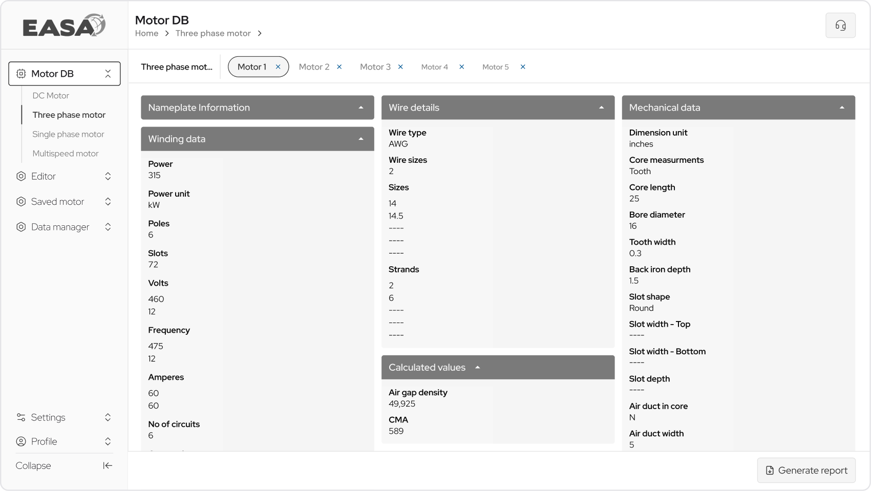
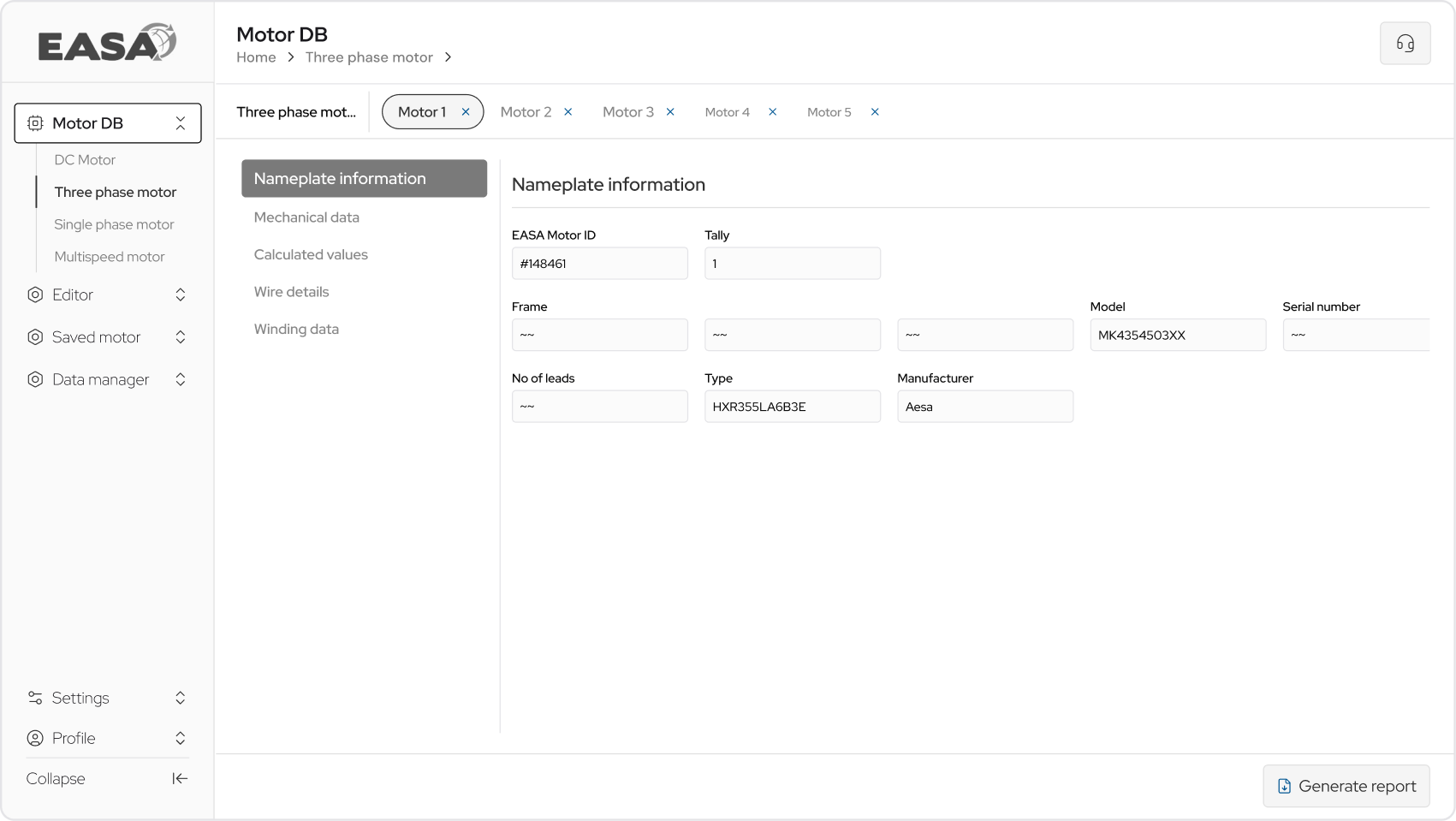
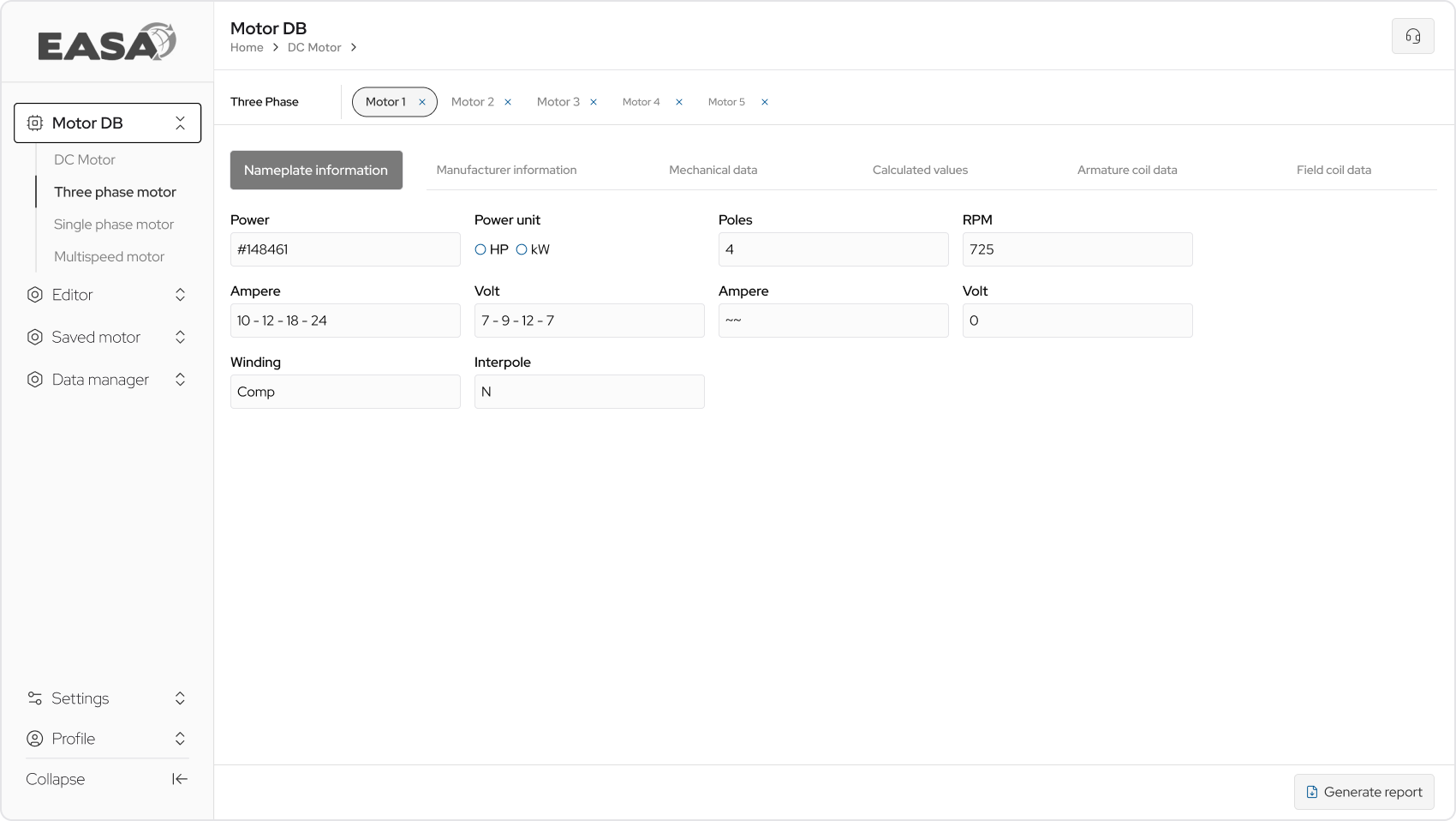
    "The product had a lot of complexity, so we decided to create high-fidelity wireframes first finalizing the exact data input fields, layout, and visual structure before development started. This way there was no back-and-forth later."

    "Created 3 different iteration to finalise one which aligned with clients visual layout in mind & better UX approach from design side"

    Version A · 16:9
    Version B · 16:9
    Version C · 16:9

    Visual Design.

    The design system

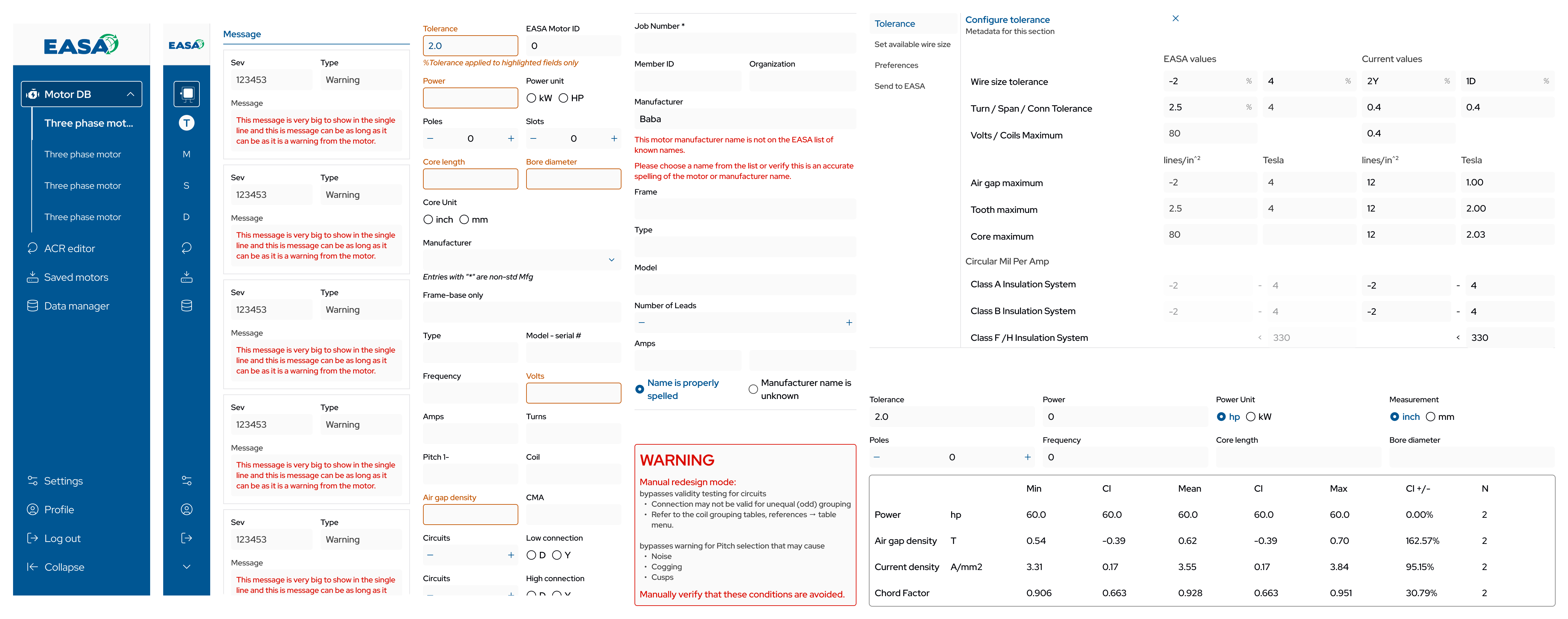
    "A product like this needs a proper design document. It helps keep the design streamlined and makes it easier to adapt when changes come up later."

    Motor DB interface

    Typography & Color Guide

    Aa
    Red Hat Display
    Google Font
    Light
    Regular
    Semibold
    Bold
    48px 40px 32px 24px 20px 16px
    Main Color
    HEX #005693
    50#F2F7FA
    100#E6EEF4
    200#CCDDE9
    300#A6C4D9
    400#669ABE
    500#005693
    600#004D84
    700#00406E
    800#003458
    900#002742
    Success
    HEX #05A364
    Error
    HEX #F70C00
    Tolerance
    HEX #C25400
    D1
    HEX #4D4D4D
    D2
    HEX #888888
    D3
    HEX #E4E4E7

    WCAG Guidelines

    • Body text contrast against the paper background meets the 4.5:1 minimum, and large headings clear the 3:1 ratio.
    • The Main Color (#005693) is reserved for primary actions and focus rings so keyboard users always see where they are.
    • Status colors (Success #05A364, Error #F70C00, Tolerance #C25400) are paired with text or icon labels so the meaning is never carried by color alone.
    • Minimum touch target on mobile is 44×44 px, with mobile icons at 16×16 standalone and 14×14 alongside button text.
    • Smallest readable body size on desktop is the 12 px Help Text style, with all interactive labels at 14 px or above.
    • Tab order follows visual reading order, and every interactive element exposes a visible focus state.

    The design

    Desktop & Mobile · 16:9

    Learnings during the process.

    Points raised by Clients & Developers
    Justification by Designers
    Client

    Dragging of pop ups. Repositionable, draggable modals were asked for.

    Designer

    The cost in development and accessibility outweighed the benefit.

    Client

    Closing the window and opening again with tabs intact.

    Designer

    Persistent tab state across full window close and reopen was technically out of scope for this phase.

    Client

    Breaking the grid and still being responsive. Some asks needed the grid to bend in ways that would have broken the responsive promise.

    Designer

    The grid stayed.

    Developer

    A functionlaity was needed, where data needed to be hold when the browser is closed.

    Designer

    [Designer justification for the above developer point.]

    Developer

    [Developer point two to be added.]

    Designer

    [Designer justification for the above developer point.]

    Non-Linear process of design

    Responsive vs Adaptive fight.

    At some point, the desktop and mobile designs didn't align properly. As a designer, I had to explain what responsive vs adaptive design actually means to the team. This also pushed us to take a different approach — one that broke some UX guidelines, but it's what the business needed most.

    Responsive vs Adaptive · 16:9

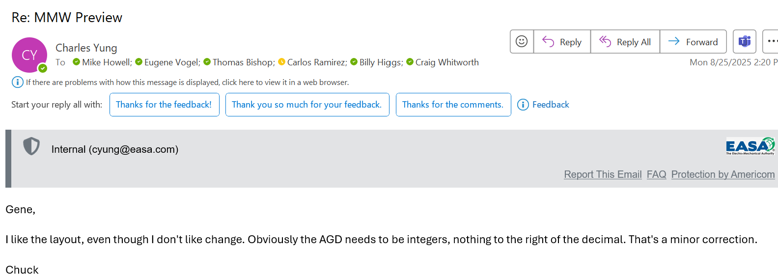
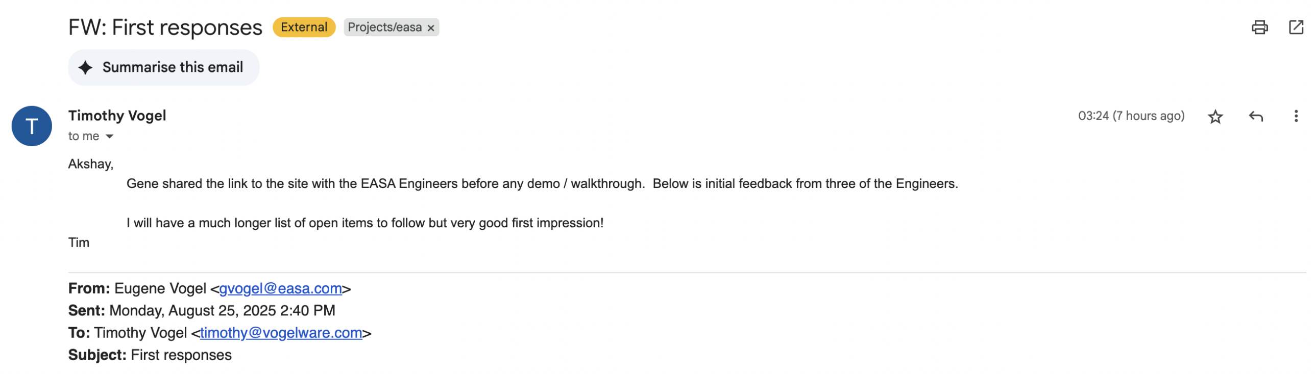
    Signing off the project

    Client testimonials.

    Client testimonial
    Client testimonial
    Client testimonial
    Client testimonial
    Client testimonial

    One thing if I can do it again.

    I would've scrapped the whole 'show all buttons upfront approach and gone with a tabbed structure instead. But the user base had a lot of older users — they needed lower cognitive load, and we also had to design around color blindness.

    One thing I learned.

    For an user group more than 50+ age group, familiarity beats novelty. The hardest task was not making the tool look new, it was making the new tool feel like the old one while keeping and increasing the business revenue.